
Redesigning an internal communications platform for over 150 school staff.
UX and information architecture redesign of Ark Elvin Academy's SharePoint, improving navigation, content discoverability, and announcement management.
Role: Sole UX Designer
Company: Ark Elvin Academy
Duration: 12 months
Team: School staff, internal stakeholders and content administrators
Platform: Microsoft SharePoint
Tools: Figma, SharePoint Editor
Deliverables: UX Audit, Information Architecture, User Flows, Navigation Structure, Wireframes, High-Fidelity Designs, Announcement Filtering System
1. Overview
Project Summary
Ark Elvin Academy relied on Microsoft SharePoint as its central hub for internal communication, housing school announcements, news, resources and staff information.
As content accumulated over time, the platform became increasingly difficult to navigate. Important information could be buried beneath unrelated content, while staff had to navigate a growing number of sections and links to find what they needed.
I led the UX redesign of the SharePoint experience as the sole UX Designer, focusing on information architecture, navigation and content organisation. The project aimed to make the platform easier for staff to use while creating a more structured and manageable system for publishing internal communications.
The Challenge
The SharePoint site had grown organically over several years, with new information and resources continually being added.
This created several problems:
Important announcements were difficult to find
Navigation had become overcrowded
Staff struggled to locate information relevant to their role
Content was organised around the site's existing structure rather than staff needs
Announcements lacked a consistent categorisation system
Different audiences across the school needed access to different information
The challenge was to create a clearer and more scalable information architecture that would help staff find relevant information quickly while making internal communications easier to manage.
My Role
As the sole UX Designer, I was responsible for the end-to-end design process, including:
Auditing the existing SharePoint experience
Identifying usability and information architecture issues
Running collaborative discovery workshops with internal stakeholders
Mapping user needs and content priorities
Restructuring navigation and content hierarchy
Designing an announcement categorisation and filtering system
Creating wireframes and high-fidelity interface designs
Working within SharePoint's technical constraints during implementation
2. Discovery
Understanding Staff Needs
Before redesigning the interface, I needed to understand how different members of staff actually used SharePoint in their day-to-day work.
I worked with members of the wider school team to explore:
Which information staff accessed most frequently
Where people experienced difficulty finding information
How announcements were currently created and managed
Which audiences needed access to specific information
Where content was duplicated or difficult to distinguish
Which parts of the existing navigation were useful or unnecessary
These discussions helped shift the focus from how information had historically been organised to how staff actually needed to find and use it.
Auditing the Existing Experience
I reviewed the existing SharePoint structure to identify areas where the information architecture was creating unnecessary friction.
The audit highlighted three connected problems:
Too much information
The platform contained a large amount of content competing for attention, making it difficult to distinguish important information from less relevant resources.
Too many pathways
As new sections had been added over time, navigation became increasingly crowded, forcing staff to scan through multiple options to find the right destination.
Limited content targeting
Announcements were largely presented as a broad stream of information, despite being intended for different groups such as departments, year groups and staff teams.
These findings shaped the two main areas of the redesign: navigation and content organisation.
3. Defining the Experience
From a Content Problem to an Information Architecture Problem
The existing experience wasn't simply difficult because there was “too much information.”
The underlying issue was that information lacked a clear structure based on staff needs, relevance and context.
The redesign therefore needed to answer two questions:
How can staff find the information they need with less effort?
How can the school organise and publish information in a way that remains manageable as content grows?
This led to two core design priorities:
Simplify the information architecture so staff could understand where to go.
Structure communications by audience and topic so relevant information could be surfaced more easily.
Defining the Navigation Structure
Rather than simply removing links from the existing sidebar, I restructured the hierarchy around the types of information staff needed to access.
Related sections were grouped together, unnecessary pathways were removed and the number of competing navigation options was reduced.
The goal was to create a clearer mental model of the SharePoint site so staff could predict where information would be located.
Defining the Announcement System
Announcements required a different approach.
The school needed to communicate information to a wide range of staff groups, but not every announcement was relevant to everyone.
I therefore explored a structured categorisation system that could connect each announcement to its intended audience.
The proposed categories included:
Key Stage
Year Group
Department
Staff Team
Topic
This created the foundation for a more targeted announcement experience.
4. Design
Streamlining Navigation
I redesigned the SharePoint sidebar to create a simpler and more logical hierarchy.
Related sections were grouped together, unnecessary links were removed and the navigation was structured around the way staff needed to access information.
The focus wasn't simply on making the interface look cleaner — it was about reducing the amount of mental effort required to understand where to go next.
Designing Smarter Announcements
The announcements area was redesigned around relevance and discoverability.
Rather than presenting every communication as an undifferentiated stream, announcements could be structured using consistent categories.
This allowed staff to browse communications in a way that better reflected their role and responsibilities.
Flexible Filtering
A key part of the redesign was introducing filtering across multiple dimensions.
Staff could use categories such as:
Key Stage
Year Group
Department
Staff Team
Topic
This allowed the same announcement system to support different audiences without requiring separate communication channels for every group.
It also created a more consistent structure for administrators when creating and managing announcements.
Designing for Different Users
One of the main UX challenges was that SharePoint served two connected but different audiences:
Staff needed to find relevant information quickly.
Content administrators needed to publish and organise information consistently.
The redesign therefore considered both sides of the experience.
For staff, the focus was findability and relevance.
For administrators, the focus was structure and consistency.
This helped ensure that improving the front-end experience didn't simply create more work behind the scenes.
Working Within SharePoint
Unlike designing a product from scratch, the project had to work within the capabilities and constraints of Microsoft SharePoint.
I used Figma to explore and communicate the proposed experience before translating the designs into SharePoint.
This required balancing the ideal UX solution with what could realistically be implemented within the existing platform.
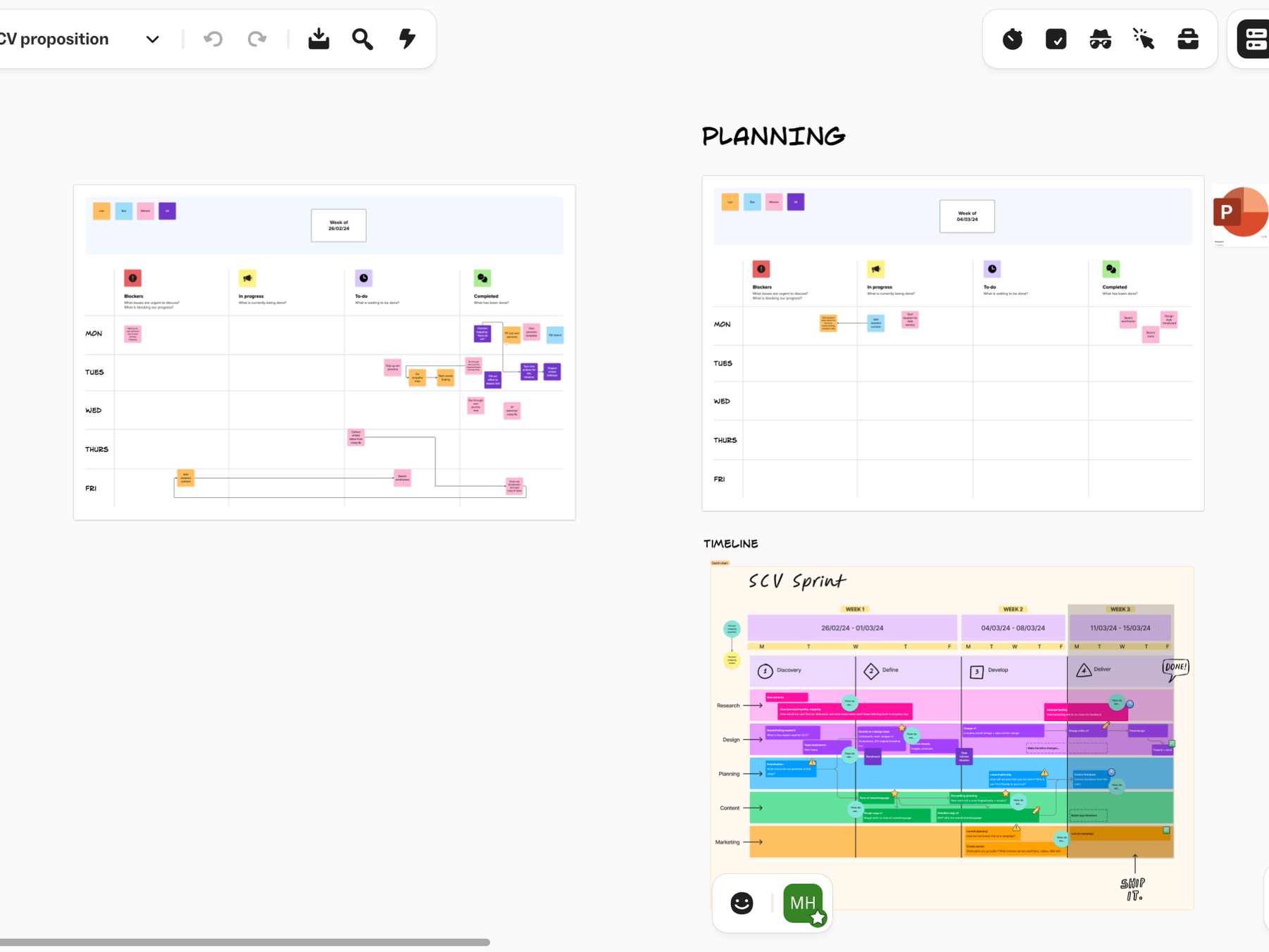
1. Planning (Kanban, horizon mapping)
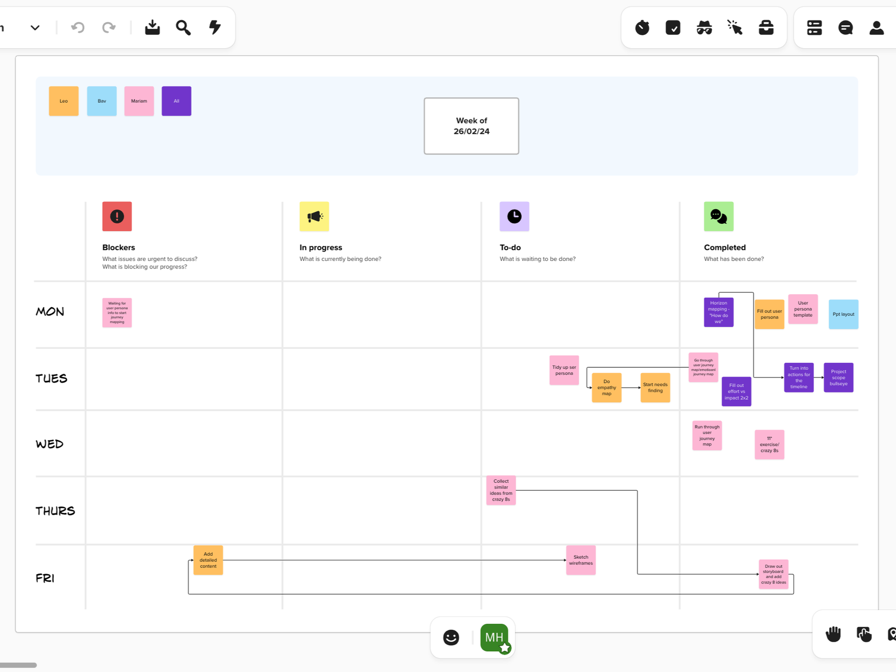
1.1 Planning - Kanban
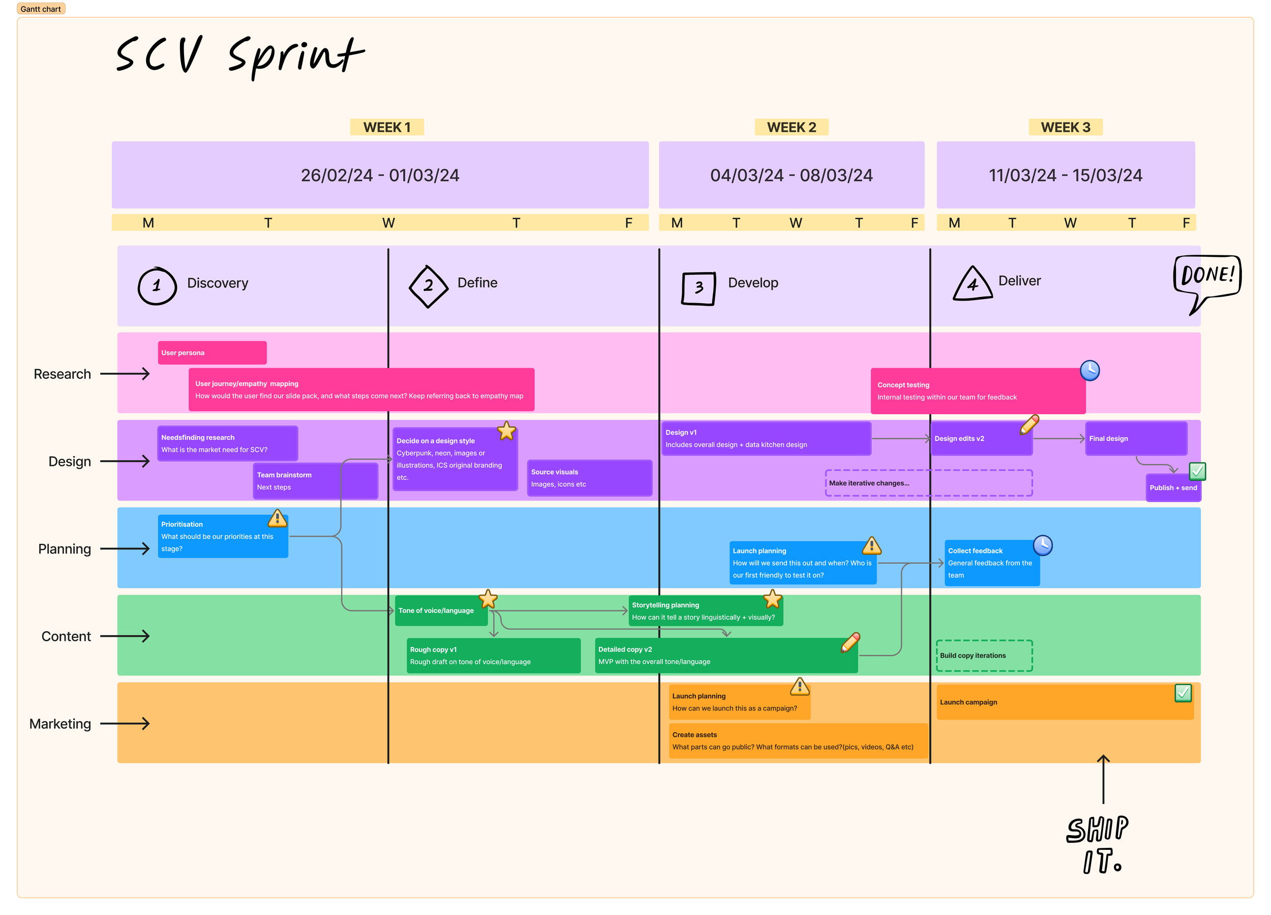
1.2 Planning - Horizon Mapping
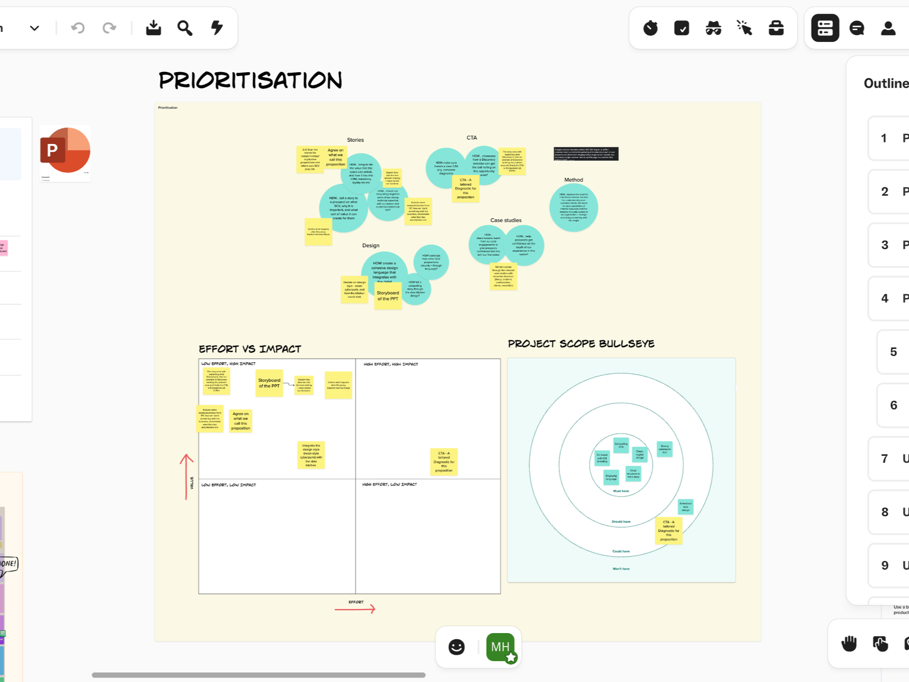
1.3. Planning - Prioritisation
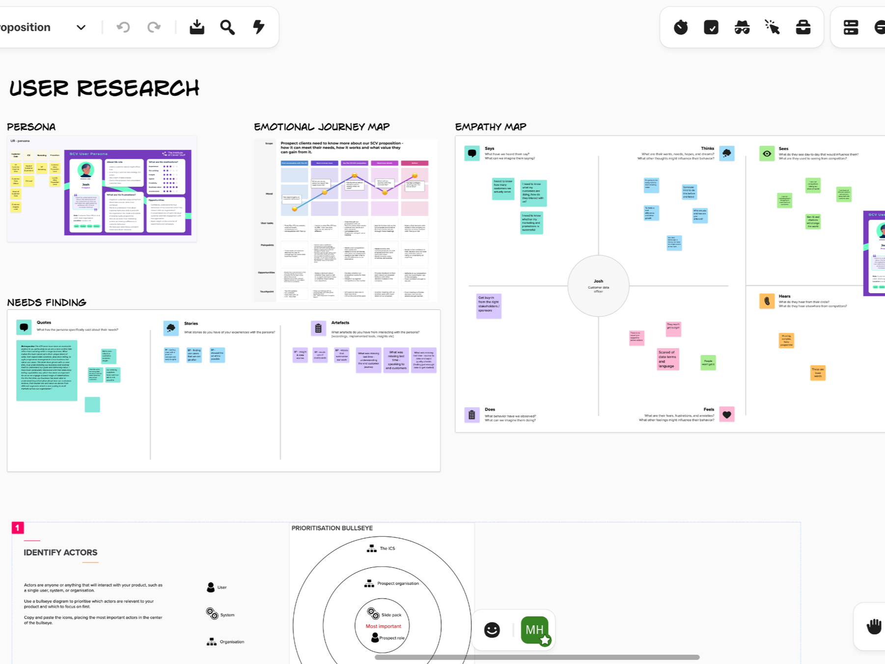
2. User Research (personas, emotional journey map, empathy map, needs finding, journey map)
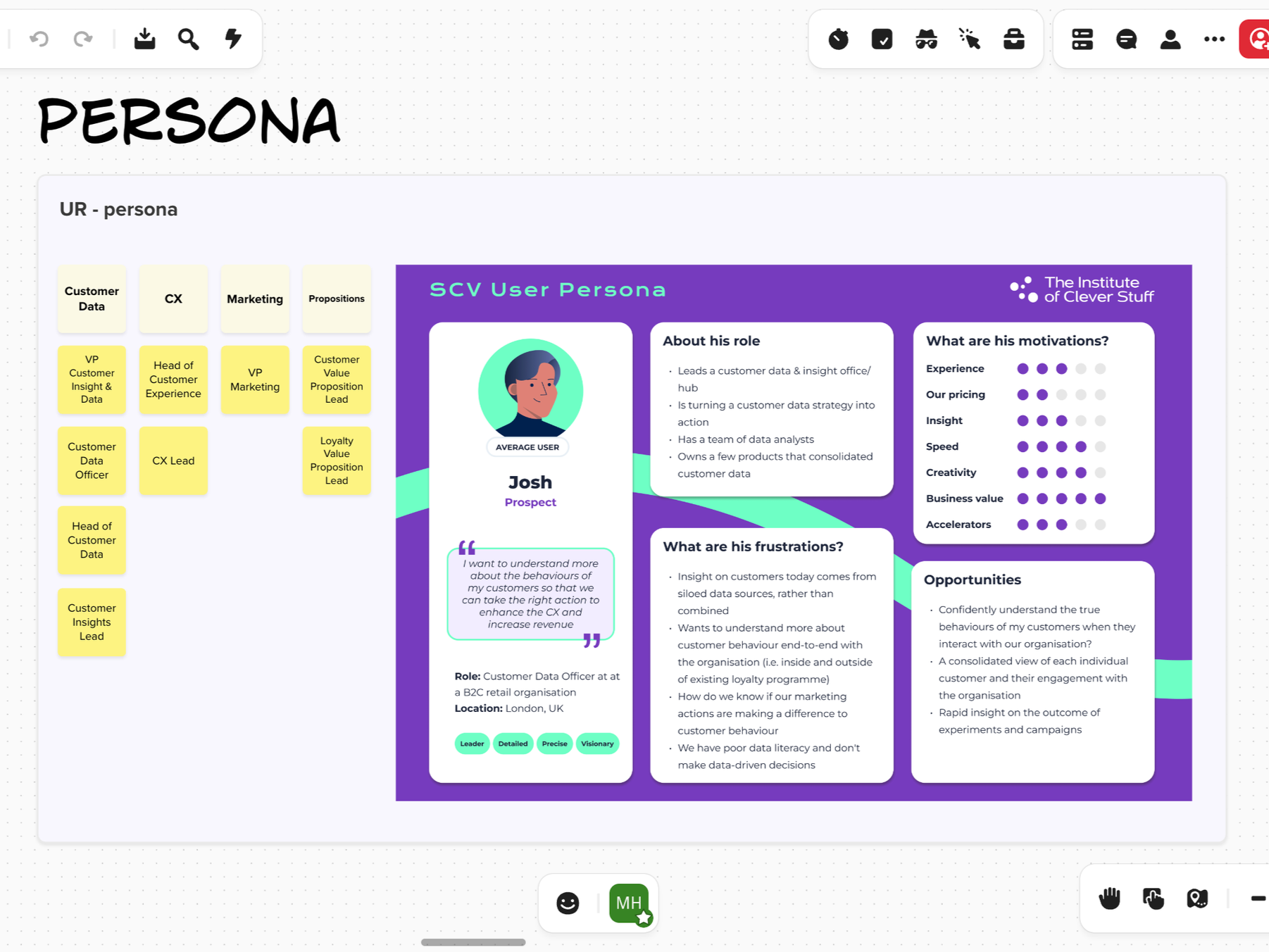
2.1 User Research - User Personas
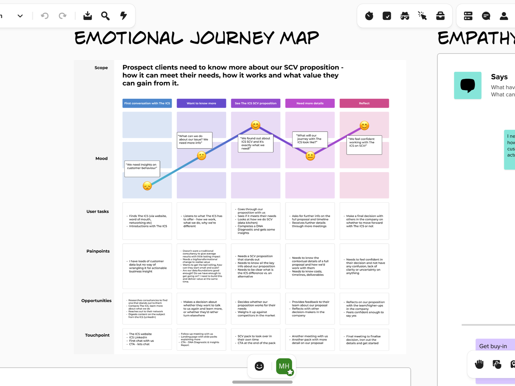
2.2 User Research - Emotional Journey Map
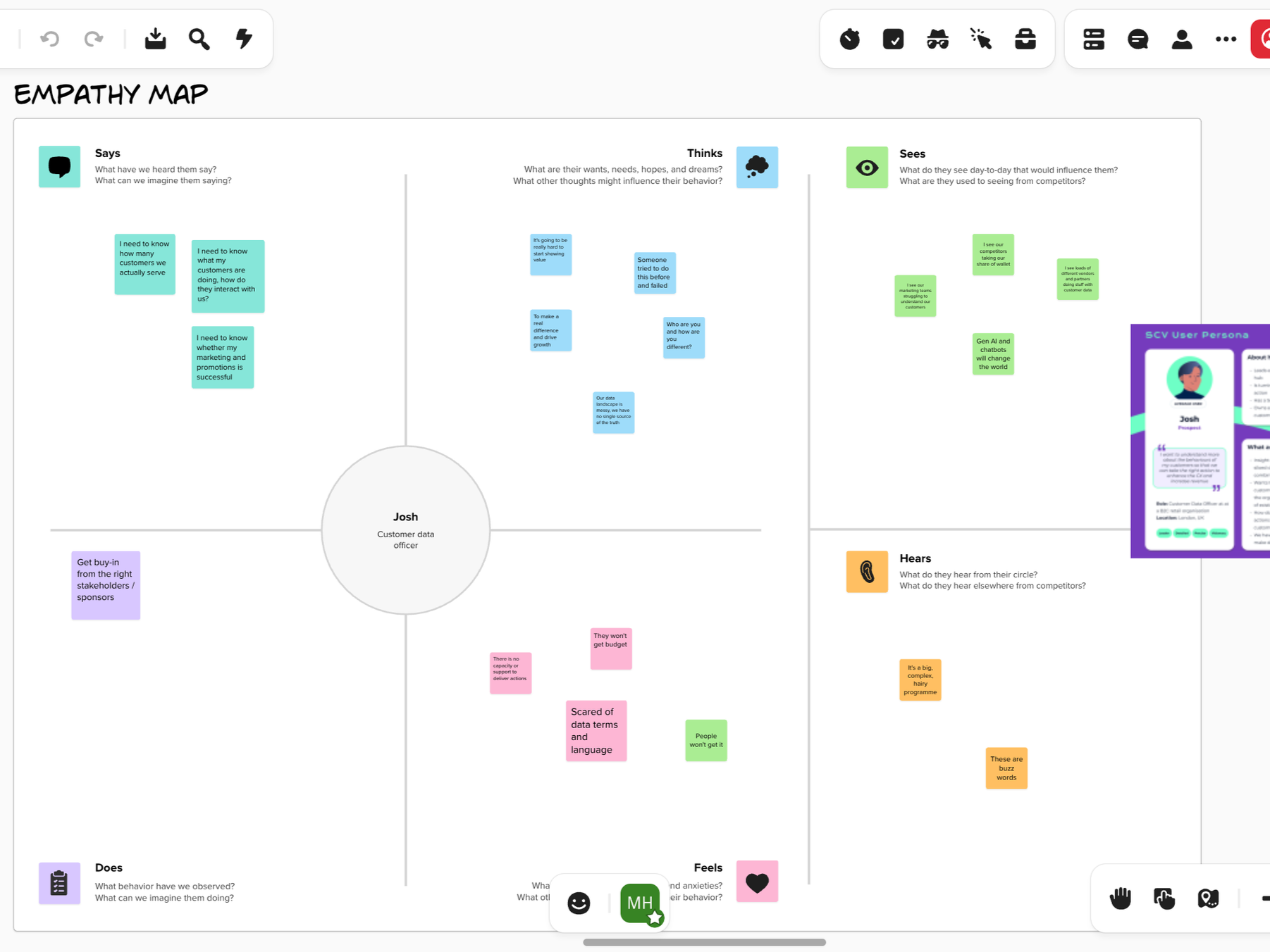
2.3 User Research - Empathy Map
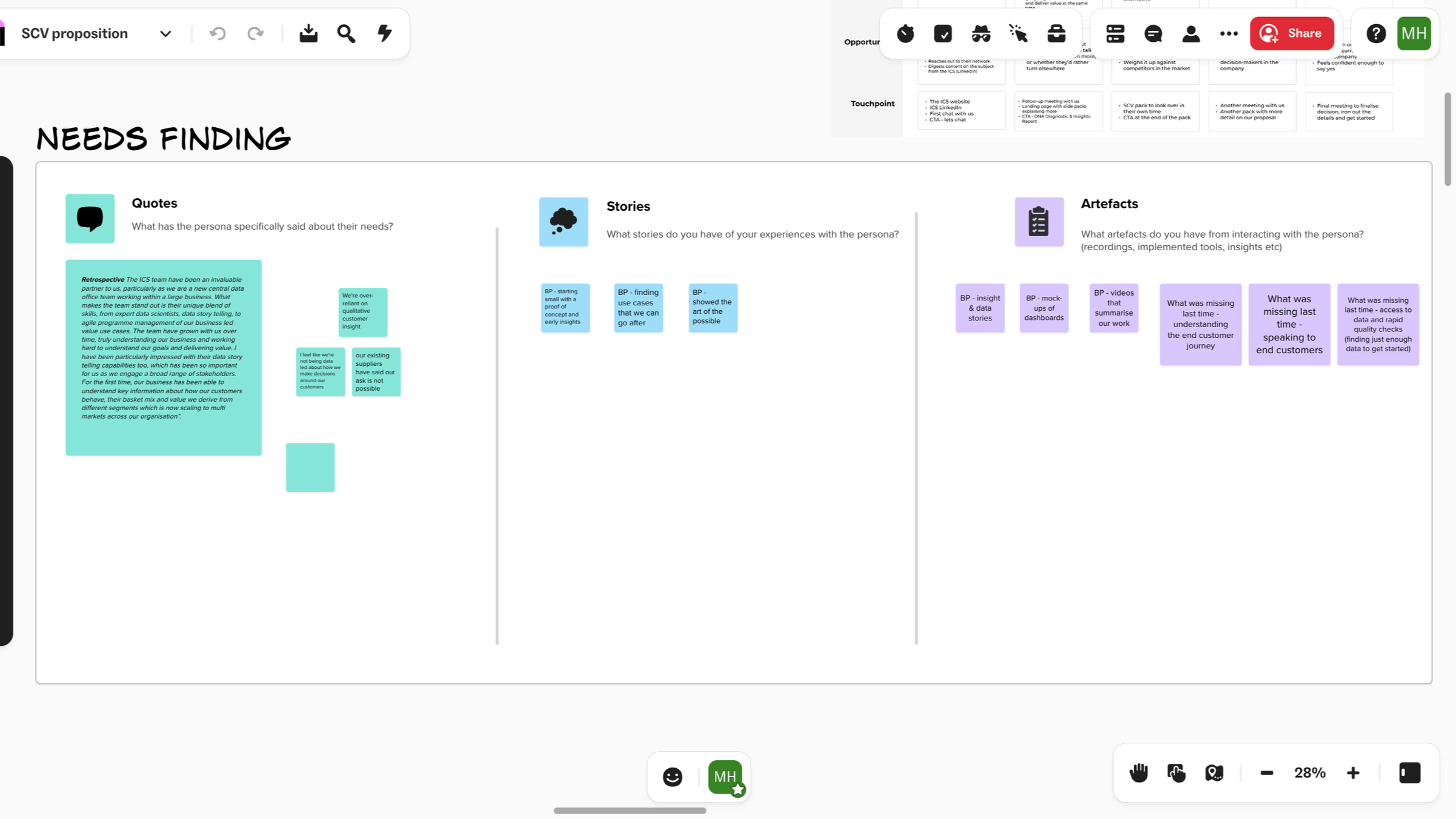
2.4 User Research - Needs Finding
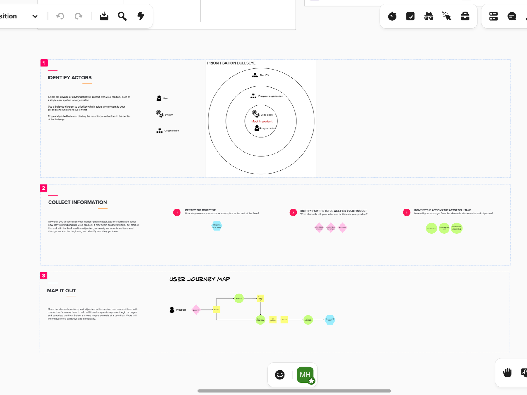
2.5. User Research - Journey Map
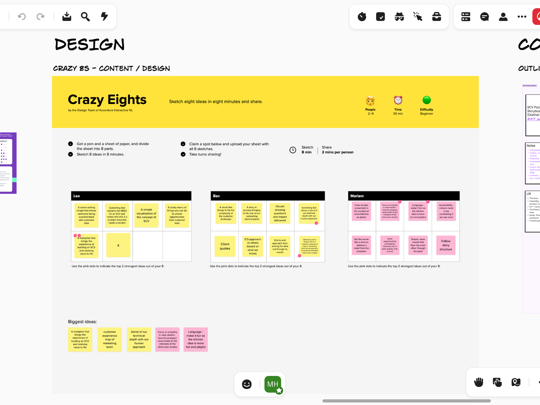
3. Design (crazy eights)
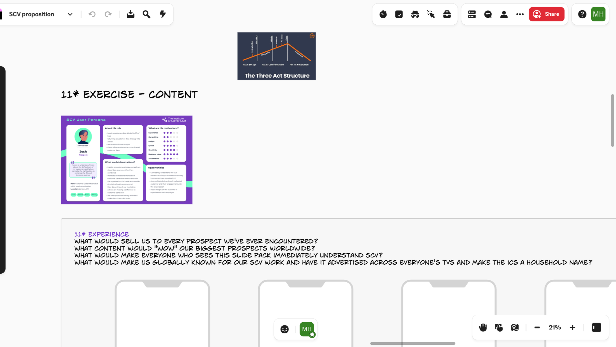
4. Content (11* exercise)
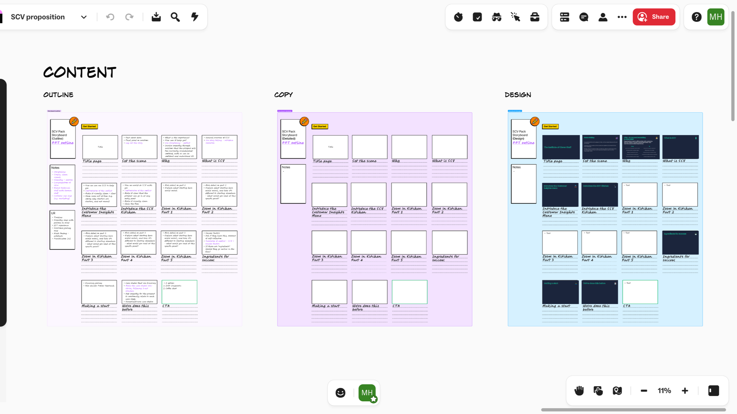
4.1. Content (storyboarding)
5. Validation
Refining the Experience
I used stakeholder feedback throughout the redesign to refine the navigation structure, content hierarchy and announcement system.
Because the platform was used across the school, feedback from different staff groups was particularly important for identifying whether the proposed structure made sense beyond a single user's workflow.
The designs were iterated based on this feedback before being translated into the SharePoint environment.
Outcome
The redesigned experience created a clearer structure for the school's internal communications platform.
Key improvements included:
A simplified navigation hierarchy
Clearer organisation of information
More targeted announcement categorisation
Filtering across different staff audiences
More consistent content publishing patterns
A more scalable approach to organising future content
The project demonstrated that improving an internal product doesn't always require introducing new technology. In this case, restructuring the information architecture and content model helped address many of the underlying usability issues within the existing platform.
6. Reflection
What I Learned
This project strengthened my understanding of information architecture as a practical UX discipline.
The biggest challenge wasn't designing individual screens — it was deciding how a large and constantly changing collection of information should be structured so that different users could make sense of it.
Working as the sole UX Designer also gave me greater ownership of the full design process, from auditing an existing product and understanding user needs through to designing the new structure and working within technical constraints.
The project strengthened my ability to:
Identify information architecture problems within an established product
Design navigation around user needs rather than organisational history
Structure complex content for different audiences
Balance user needs with content-management requirements
Design within the constraints of an existing platform
Communicate UX decisions to non-design stakeholders
Think about scalability and maintainability beyond the initial redesign
Skills Demonstrated
Information Architecture · UX Research · UX Audit · Navigation Design · Content Strategy · User Flows · Wireframing · Interaction Design · Prototyping · Stakeholder Collaboration · SharePoint · Responsive Content Design